
Project / Design for a performing and visual arts organisation
Task / Corporate Branding, Logos & Promotional Materials
Client / Sutra Dance Theatre, Sutra Foundation
Year / 1986—present
Designers / Over the years, many of our designers have contributed to Sutra’s visual design; one of the earliest was Kuan Kee Onn.
“I have known Ramli Ibrahim for a very long time—nearly half a lifetime by now. I recall watching him dance when he returned to Malaysia from Australia in 1983.
My first commission to design for Ramli was for ‘Adorations’ in 1986. ‘Adorations’ was a significant work, an Odissi dance performance scripted with a dialogue between the guru (Malaysian actor Mano Maniam) and his disciple (Ramli), elucidating the audience with concepts and meaning of the gesture, movement, and terminology in the Indian classical dance.
It was the first time in Malaysia that an Indian classical dance performance attracted so many people from different ethnic backgrounds, transcending racial and cultural barriers.”
late 80s—sutra dance theatre logo
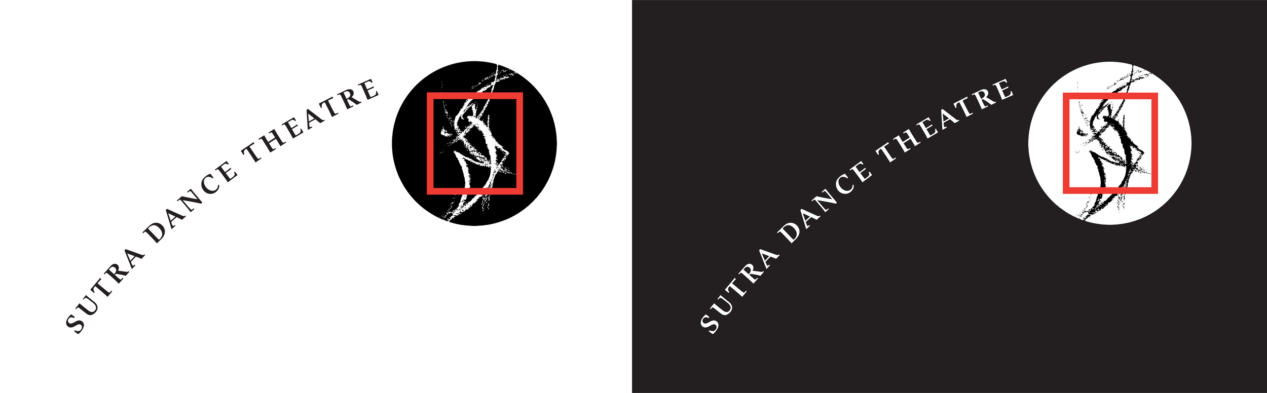
Ramli Ibrahim established Sutra Dance Theatre in 1983. The logo’s bold red square frames an abstract rendition of dancers in motion, positioning the company as a vital centre to nurture Malaysian performing arts.
The logotype ‘Sutra Dance Theatre’ can be repositioned anywhere around the logo, allowing for flexibility in its application.
“I chose red as Sutra’s primary colour as a nod to its significant role in the Indian classical dance, namely the Alta red dye applied on the fingers and feet of an Indian Classical dancer.
Lips painted bright red emphasise smiles, pouts, and other lip motions. The tips of the fingers and toes are coloured red to help the audience see the hand gestures and feet. Over time, red became a recognisable identity element of the dance company.”
LATE 80S TO 2006—VISUAL IDENTITY

Sutra Dance Theatre media folder, front (left) and back (right)


Sutra Dance Theatre letterhead

Poster for Contes d’été, Sommer Märchen (Summer Tales), a work under Sutra’s Under the Stars 2003 series. During this early period, some high chroma compositions were explored.
2007—SUTRA FOUNDATION logo

Sutra Foundation, established in 2007, is bequeathed to Malaysia by Ramli Ibrahim. The Foundation strives to develop the breadth and depth of Malaysian performing and visual arts by stimulating the creative spirit of cross-cultural Malaysia.
We designed the Sutra Foundation logo and chose Helvetica for its logotype. The typeface is modern, universal, neutral and timeless—a complete contrast to the decorative san serif typefaces favoured by many Indian classical dance groups.
The logotype for Sutra Dance Theatre followed suit.

Under Sutra Foundation, Sutra Dance Theatre’s activities at the Sutra House include performances held at its outdoor Amphi-Sutra, exhibitions at Sutra Gallery, and teaching sessions at the Sutra Academy.
We devised a brand architecture to incorporate these diverse physical spaces and activities.

2014—SUTRA DANCE THEATRE (NEW LOGO)
Ten years on, we reduced the complexity of the Sutra Dance Theatre logo to an elementary form.
Still based on the original concept of dancers in motion, the symbol is asymmetrical—it is alive and spontaneous, moving towards balance and symmetry, and imbued with creative tension.

SUTRA’s new IDENTITY 2003
“Publicity materials for Indian classical dance performances at the time had fanciful typefaces, and sometimes roman letters that mimic an Indian script.
I chose the simplicity of Helvetica for Sutra’s identity refresh, launched in conjunction with ‘Sutrarasa’, the 6th Sutra Festival—a radical departure from the typographic norm.”
2003 saw a new direction for Sutra’s visual identity. Its posters featured a single, powerful image concept, composed and photographed by Sivarajah Natarajan—a departure from the previous practice of using available images in a montage.
Sutra’s in-house team or freelancers designed many of the later posters and the application of Helvetica as a primary font was discontinued, allowing each designer to choose display typefaces that best suited the concept.


Programme book, back cover (left), and Ramli on the front cover (right).

Accordion-fold leaflet.


Invitation card for the 6th Sutra Festival, Sutrarasa (closed).

Invitation card for the 6th Sutra Festival, Sutrarasa (open).
THE EARLY YEARS—FULLY INTEGRATED IDENTITY
Before the introduction of e-tickets and e-invites, we had to design a complex set of colour-coded tickets and invitation cards for each Sutra Festival.

Tickets, invitation cards and leaflets for the 4th Sutra Festival, Restu (1995).
SELECTED POSTERS (1997—CURRENT)
In chronological order
Posters for Sutra contain substantial text information and logos of sponsors.


