Project / Atria Shopping Gallery, Selangor
Task / Brand & Identity Design, Communication, Wayfinding & Signage
Client / OSK Property
Year/ 2012–2015
Lead Designer (Communication): William Harald-Wong
Photography of key images_Yipieyaya Studio
An integrated design project
Link: Atria Wayfinding & Signage
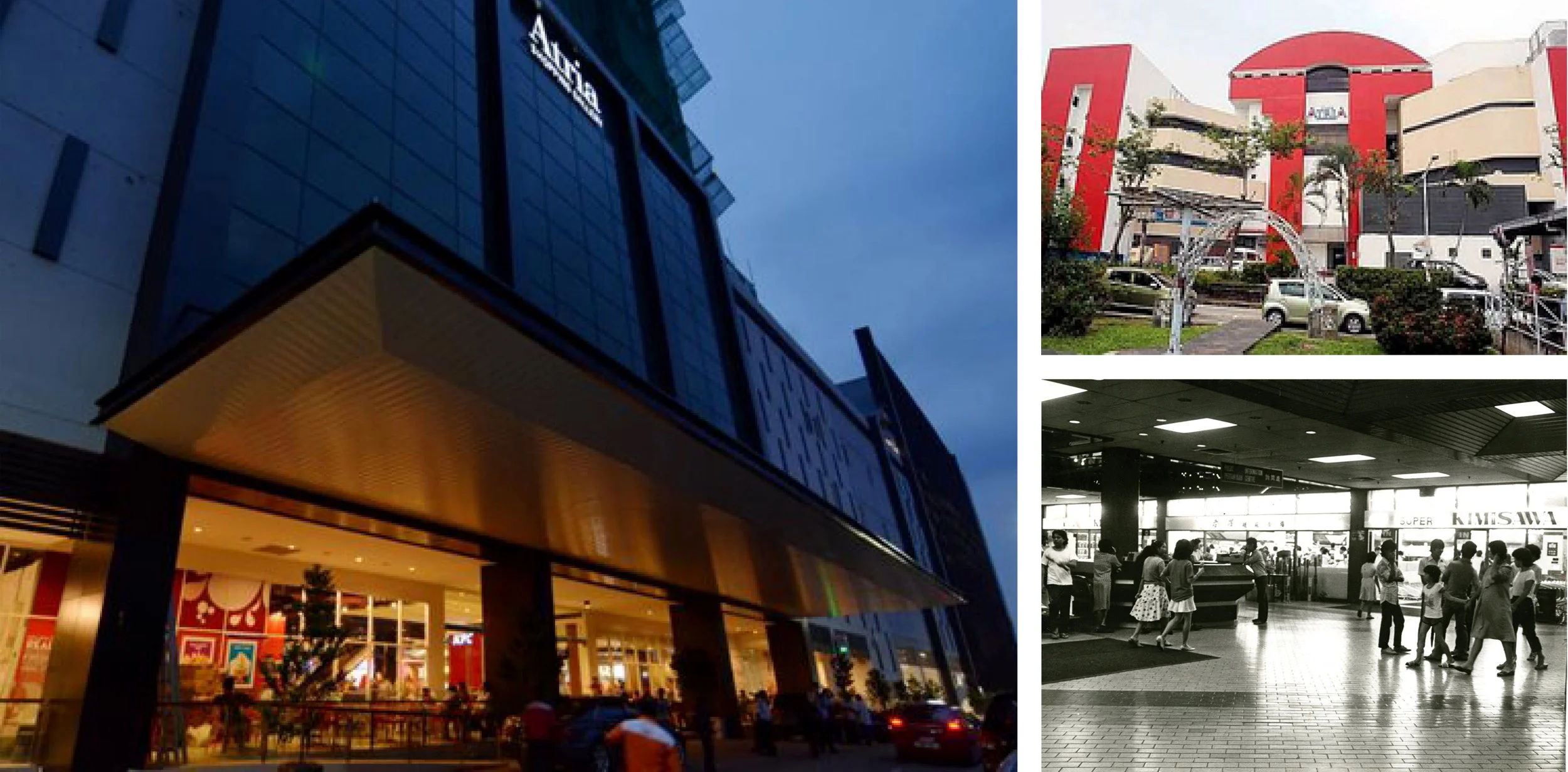
Atria was one of Klang Valley’s iconic malls in the mid-1980s. Atria Shopping Gallery (its new name) embarked on a repositioning and rebranding exercise after the building was renovated, to revitalise the old but beloved neighbourhood mall into a more stylish and sophisticated destination.
Above: Atria Shopping Gallery today—a total transformation in all aspects.
Top right: Atria in the 80s, known for its infamous Piccadilly Discotheque, fashion-forward Printemps department store, and Kimisawa (bottom, right), Malaysia's first Japanese supermarket.
Logo & VISUAL IDENTITY
Work on Atria’s logo and brand positioning started one year after we began our wayfinding and signage programme for them.
The new interior architecture was inspired by the natural beauty and forms found in the Malaysian tropical rainforest, and sought to deliver a sense of natural opulence within a contemporary retail setting.
As such, the new logo, visual identity and communication reflected a similar intention—Atria offers the sophistication of a premier mall alongside a beautiful and relaxing environment inspired by nature.
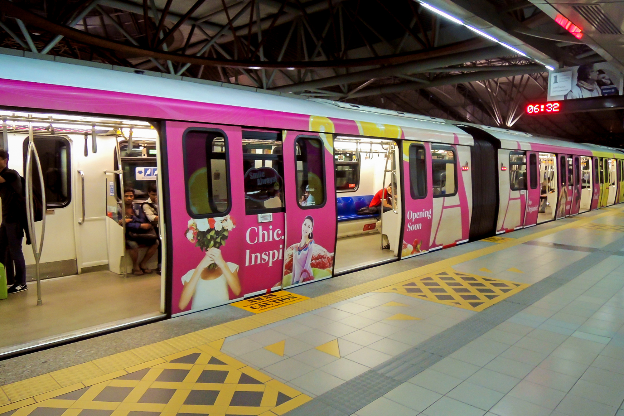
The logo is pure typography, simple and understated like many premium fashion brands. It is black-and-white, extremely rare for a neighbourhood mall, but it is often accompanied by an alphabet ‘A’ in brilliant fuchsia that gives the identity its vibrancy. Elements derived from nature (e.g. the flow of air, or water in a stream, pebbles, wood, etc.) are used across all applications for a consistent, integrated look.
LINK
Atria Wayfinding & Signage


