Project / Sungei Wang Rebranding
Task / Logo & Visual Identity Design, Sub-brand, Website Master Templates, Launch Materials, CI Guidelines
Structural—Redesign of Entrances and Canopies, 3D Logo at former site of fountain
Client / Sungei Wang Management Corporation & CapitaLand
Year / 2017–2018
Old photographs courtesy of Sungei Wang
Established in 1977, the iconic Sungei Wang Plaza was the second shopping centre to be built in Kuala Lumpur after Ampang Park, and is remembered fondly by many of the older generation as one of their favourite places to visit. Sungei Wang Plaza was built on the site of the former Shaw Brothers’ BB Plaza, a well-loved amusement centre where Taiwanese singer Teresa Tang once performed when she was ten years old*.
*Interview with Huangmei, sinchew.com.my (7 March 2017)


Sungei Wang Plaza in the late 70s, and 80s (top, right) was synonymous with fashion, food and beauty products, and was the epicentre of ‘La La Culture’. It was also an entertainment paradise with an Olympic-size ice skating rink, bumper cars, game arcade, discotheque hall and Malaysia’s first indoor cinema which could accommodate 1,700 people. Sungei Wang Plaza was THE venue for fashion shows, beauty contests, the annual ‘Campus King and Queen’ and ‘Lantern Parade’, ‘Meet-and-Greet’ artiste concerts, and festive countdowns. A Chinese Opera theatre stage would be set up on its rooftop during important Chinese festivals.
“If you have not been to Sungei Wang Plaza, you have not been to Kuala Lumpur.”


The new Logo
“Designing a new logo and identity for Sungei Wang Plaza is a heavy responsibility as we have to preserve its legacy, much loved and alive in people’s memories; and yet be forward-looking and appeal to a new generation—the Millennials.
This transformation will take place over a few years. Watch this space.”
In conjunction with its 40th Anniversary in November 2017, Sungei Wang embarks on a rebranding exercise to present itself as a younger, trendier brand that hopes to appeal to the new generation without losing sight of its history and legacy.
We redesigned Sungei Wang’s logo to give it a more contemporary feel. A decision was made to retain its familiar dollar sign symbol as well as the original orange and green colour. We then added gold to Sungei Wang's symbol to represent their ambition in bringing prosperity and a good life to their tenants and customers. (William’s remark—‘how can Sungei Wang not have gold?’)
The wave motif in the middle of the new symbol represents the energy and the lively atmosphere within Sungei Wang.

The dollar sign symbol was simplified and can be read either as the letter ‘S’ or a dollar sign if one is familiar with the old symbol. In addition, the new symbol is composed of two question marks (one upside down) defining an area of lively energy, a visual interpretation of customers looking for “All Kinds of Everything”—its old slogan, but still relevant today.

THE VISUAL IDENTITY
We introduced two sets of icons to represent Sungei Wang’s personality and specialties: icons that represent Sungei Wang’s peerless past, and Sungei Wang today, and looking to the future. In total, we created more than 60 icons for its visual identity, applied to name cards, launch materials and marketing collaterals.
The Legacy icons convey a retro, nostalgic feel—perfect to highlight the historical and heritage value of Sungei Wang.
The Modern icons, in contrast, are vibrant and colourful, designed to highlight the energy and vitality of Sungei Wang. It is also a step forward in helping Sungei Wang appeal to the tastes of the Millennials.
Following are pages from the CI Guidelines.


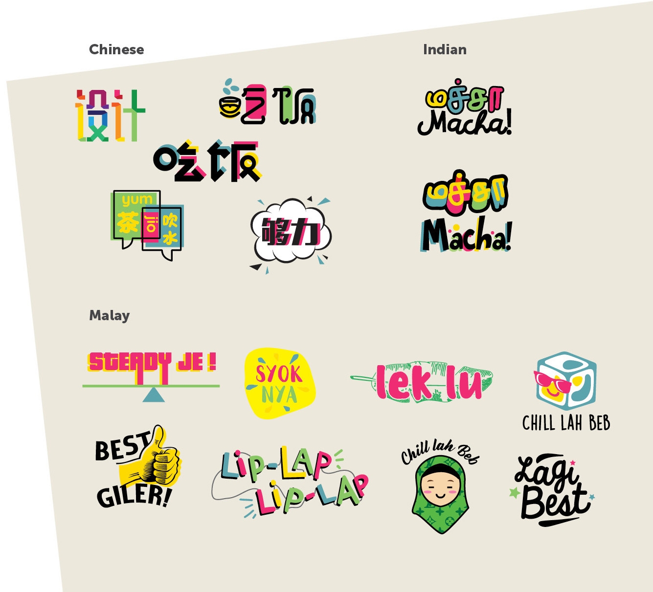
Sungei Wang is inclusive. For a start, icons are available in several languages: English, Chinese, Malay, Tamil, Iban and Kadazan.
Culture Street
Culture Street, a new sub-brand of Sungei Wang, will house Karyaneka, a government-owned company that aims to preserve and promote Malaysian crafts, as well as ‘Malaysia’s Best’, a one-stop centre selling the best packaged foodstuff and other products sourced from all over Malaysia.
The logo for Culture Street is an abbreviation of Culture Street (CS) and is inspired by traditional batik floral motifs.

CULTURE STREET ENTRANCE
Our designers are currently working on Sungei Wang’s five main entrances, with the Culture Street entrance having its own distinctive portal design.

4 January 2018: Entrance portal design for Culture Street. Sungai Wang’s famous—or infamous—but nonetheless iconic “jaws” canopy will be dismantled, to be replaced with a more modern, simple, and elegant design.

13 January 2018: The triangular shapes comprising traditional tiles are duplicated along the corridor inside the entrance, creating a distinctive ‘street’ for kiosks currently being designed by Karyaneka.


“While documenting our work, I noticed that children seem particularly attracted to the colourful tiles, moving from one triangle to another, and doing a short dance of joy on some of them”
Corporate identity guidelines
The CI Guidelines for Sungei Wang takes on a more playful approach in layout and writing style even as we convey all the important details. It resonates with the mall’s personality and pre-eminence as Malaysia’s original startup and entrepreneurial hub. Many of Malaysia’s renowned fashion designers, including Zang Toi, and artistes, started their careers here.
With Sungei Wang making plans to introduce co-working areas, tech spaces, and an innovation ecosystem to attract the young entrepreneurs of today, the CI Guidelines is only one small step towards helping the organisaation reach out to their new audience.


LAUNCH of sungei wang’s new identity
Sungei Wang’s new identity was unveiled in conjunction with its 40th Anniversary and includes special 40th Anniversary letterhead and name cards, paper bag, media folder, posters, nametags, lanyards, etc.
The 40th Anniversary marks the beginning of Sungei Wang’s three-year transformation. The change is not limited to its logo, identity, and new retail offerings. Instead, it is a whole re-evaluation and re-conceptualisation of how space can be used to enhance the visitor experience.


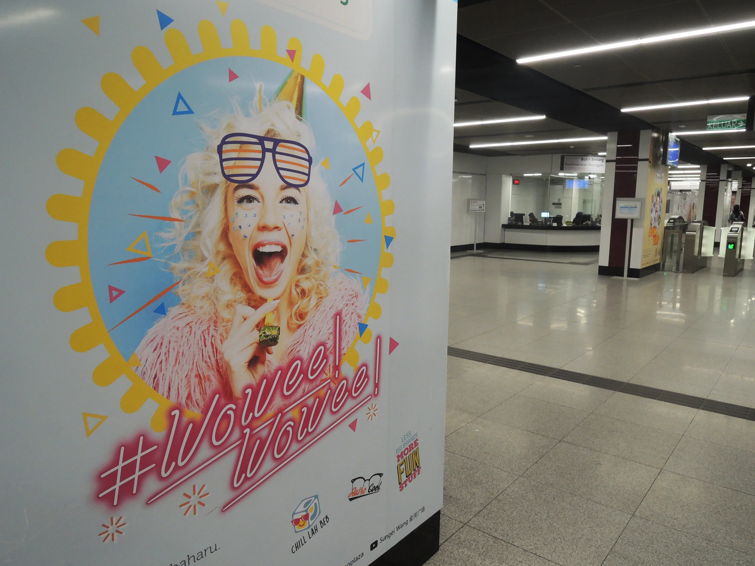
The Bukit Bintang MRT station, adjacent to Sungei Wang