Projects / East Ledang & Anjung, Iskandar Puteri, Johor
Task / Signage & Placemaking
Client / UEM Land
Year / 2008
For our branding and visual identity work for East Ledang, please view Brand_East Ledang
Environmental design
Our designers explored a collection of signs and structures such as show house identifier signs, garden identifier signs, clock tower, precinct markers, etc., to enhance the quality of the landscape. The show house and garden identifier signs were fabricated and installed but the rest were aborted due to the economic recession of 2008.
“One needs to feel through the five senses the essence of the place and how these characteristics can be expressed through design.
Sites with a unique character stay in our memory.”
CLOCK TOWER
The original proposal the for clock tower in front of the security guardhouse / entrance was a traditional Malay structure. However the client felt it was out of place among the modern setting and we were asked to present an alternative.
Our solution was a sleek clock tower that displays the time in key capital cities. This approach supports the aspiration of the brand as the clock tower immediately communicates to visitors that East Ledang values and celebrates a community that is international.
A minimal design fits better with the modern residences of East Ledang.
PRECINCT LANDMARKS
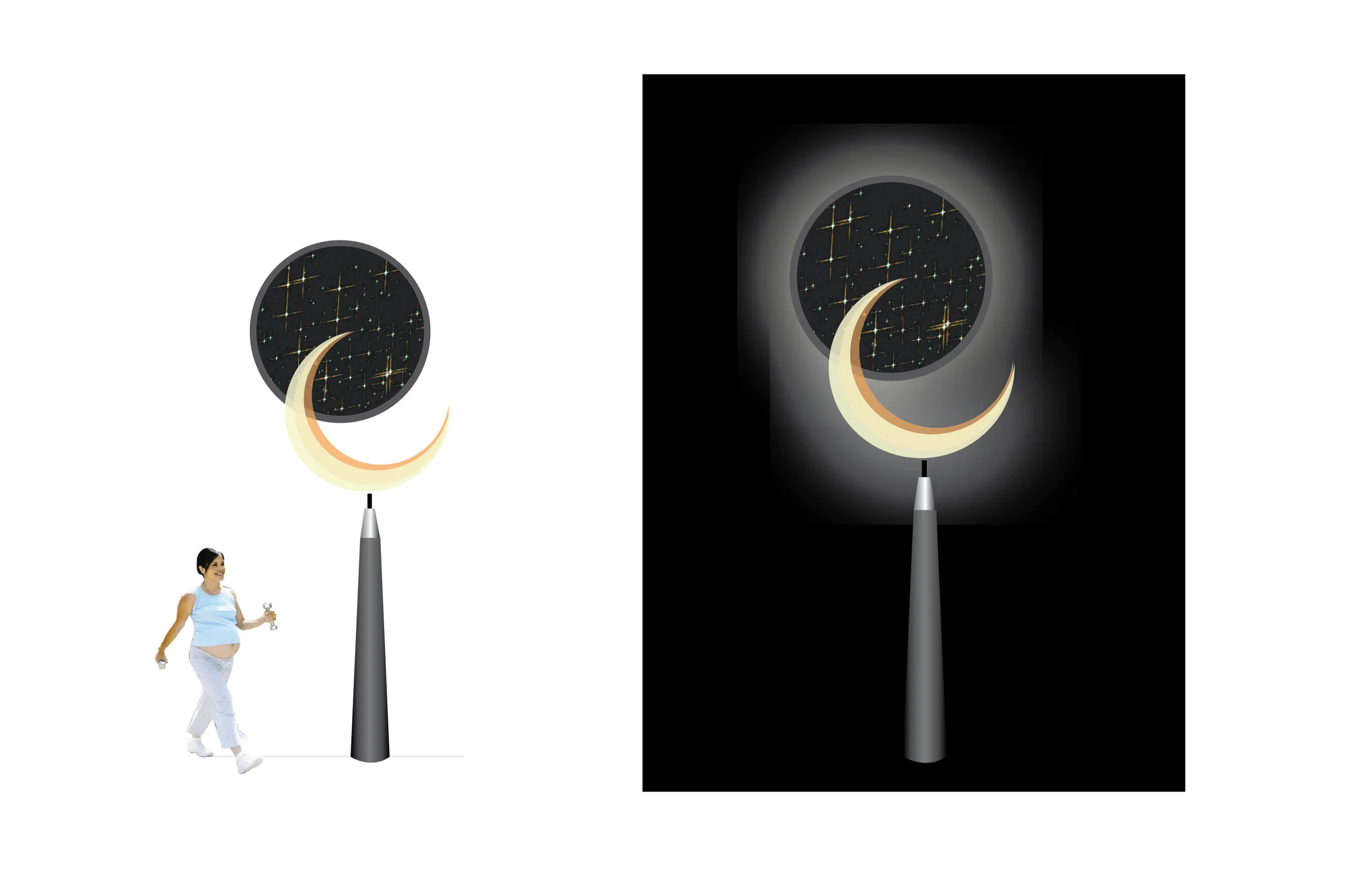
We proposed landmarks to be placed at the entrance of each of the seven precincts, together with the name of the precinct. The designs were contemporary and based on nature themes. An example:
Precinct Landmark 5:
Crescent Moon & Star Constellation
The Crescent moon is in chrome gold and is illuminated at night. The stars are animated using LEDs, changing their configurations to match various star formations.
GARDEN SCULPTURES
Sculptures and installation art were designed for some of the 31 mood gardens, based on forms found in the natural world.
An example:
The Living Forest
Inspired by the mobiles of sculptor Alexander Calder
Silhouettes of fauna and flora in cut-out aluminium move and dance with the wind.
DIRECTIONAL SIGNAGE
A leaf-shaped signage system was explored on the computer.
BOUNDARY WALL
Design for the boundary wall next to the main entrance to the development.
SHOW HOUSE IDENTIFIER SIGNS
A combination of gold and frosted glass lent an exclusive feel to the development.
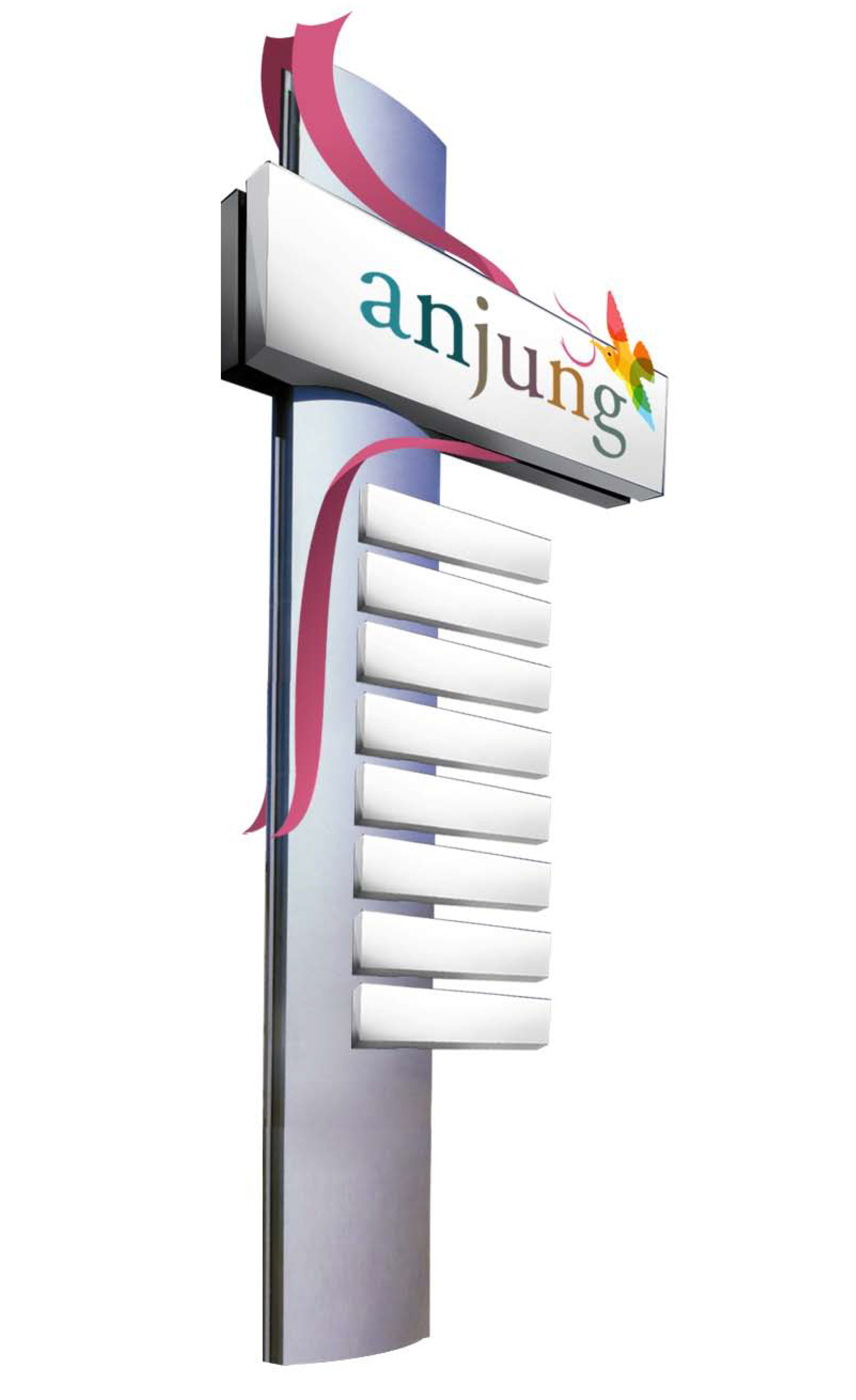
ANJUNG—East ledang’s neighbourhood retail centre
We were working concurrently on the logo and signage for Anjung, the small neighbourhood retail centre being built for the convenience of East Ledang’s residents. (Nusajaya is a new city with a sparse population and at the time there were no other retail shops in the vicinity).
The logo of the bird with the ribbon came from the idea that one would leave the nest and return from Anjung with food, grocery, etc.
Anjung is a fairly small, open retail space—the food court, supermarket and restaurant area can be easily seen on arrival. Therefore, Anjung will need only a basic number of signs, the most important being the direction to the toilets.
“When the architectural layout is intuitive, one can do less with signs, reducing costs and eliminating redundancy.
There are no signs in the interior of our latest project, Muzium Masjid Sultan Abdullah (Islamic Arts Museum) in Pekan as the layout is logical and the function of every space is obvious to a visitor.”
Early in the project we had designed signboards for some key areas but they were not implemented as we decided they were decorative and did not serve any wayfinding function (budget was also limited).
LINK


