Project / 1 Mont Kiara
Task / Re-branding, Logo & Visual Identity Design
Client / ARA Asset Management (Asia Dragon) / 1MK Office
Year/ 2013–2014
Architects / DYXY Design, Los Angeles
Lead Designers / William Harald-Wong & Shawn Chow
When ARA Asset Management took over the ownership of 1 Mont Kiara (1MK), there were many architectural–structural problems which had to be rectified—from a faceless façade and weak signage, to poor circulation and an overall dull colour scheme, among other issues.
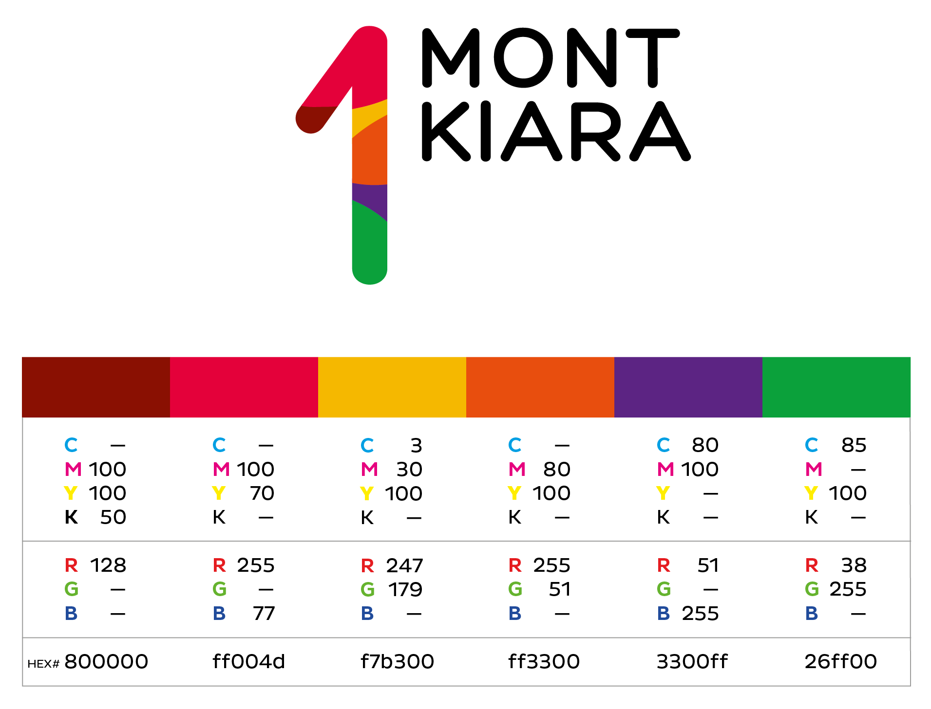
The existing interior colour scheme of dark grey, light grey, and black ceiling (extended from the adjoining office block) was too cold and monotonous for a retail mall. A more vibrant colour palette, based on the warm hues of the tropics, was introduced in the interior spaces (but balanced with wood and neutrals). These tropical colours were also used in 1MK’s new logo.
BUILDING FAçADE & SIGNAGE
The old façade had black glass, which hid the retail spaces. Viewed from the street, potential visitors are unable to see any activity or ‘buzz’—an important element for malls.
The new façade differentiates the mall from the adjoining office and residential towers. While some may think that placing three logos on a building’s street-facing façade may seem excessive, it was necessary to cater to different points of view in a tight and cluttered environment with different vehicular access. (The new signage was designed by the architect working with the 1MK team).
BRAND POSITIONING
The Mont Kiara area is dense with high-rise condominiums, many within walking distance to 1MK. The mall is blessed with affluent and repeat customers, drawing from the large expatriate community in the vicinity, as well as office workers who crowd the F&B outlets during lunch hour.
For many of its customers, 1MK is familiar ground, almost like an extension of their home. The interior spaces were especially reworked to enhance comfort and convenience besides realigning the tenant mix to best serve the needs of 1MK’s customers.
Drawing from this reasoning, we therefore gave 1MK a new tagline, “Welcome Home”, and aligned communication to reflect this positioning.
Mont Kiara is the fastest-growing expat neighbourhood in the country, with many Japanese, Korean and European families setting root there. Expats comprise more than 50% of residents in this district.
1MK underwent a year of renovation for this rebranding exercise. During this period of time, temporary hoardings played a important role in directing traffic as different sections of the mall were renovated at different periods, thus having their access blocked. The hoarding also informed visitors of improvements to the mall, as well as 1MK’s new identity and promise.


