Project / SP Setia (Corporate)
Task / Branding, Brand Internalisation, Communications, Wayfinding & Signage
Client / SP Setia
Year / 1977–2013
The first time SP Setia approached us for our services, we were obliged to decline due to concerns of conflict of interest as we were in the midst of branding the Kuok Group’s new property development company, Berinda (established to replace Pelangi, which was sold to PNB).
“SP Setia was established in Johor, but it enjoyed a huge success in the Klang Valley.
When it chose to return to its homeground, it did so with an impact. SP Setia street buntings lined what felt like the entire stretch of the highway leading to the city. Their billboard presented a rendering of a two-and-a-half-storey building in actual size, introducing modern residential architecture never seen before in Johor.
Anyone would have felt awed by the strength of its brand.”
Driving Eco-Awareness
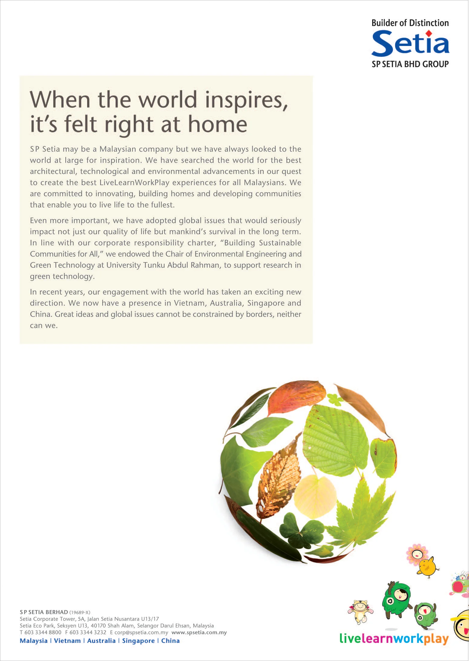
Two years later, we were able to work closely with SP Setia Corporate Communications to position the organisation as an eco and sustainable developer.
The first task at hand was brand internalisation—creating awareness among staff members on all levels so that they ‘walk the talk’. And there is no better way to do it than through animated characters and comic strips.
Consequently, we created two tree-like characters: ‘ECO’ and ‘eco’. ECO, a male persona, is designed to represent the conventional opinions regarding sustainability. Personality-wise, he is somewhat of a know-it-all, prone to dispensing information about sustainability.
eco, on the other hand, is a spunky female who sometimes acts as the devil’s advocate, questioning the validity of ECO’s statements. Occasionally, she also adds a dose of wisdom to better educate the audience.
Together, ECO and eco embodies SP Setia’s vision in contributing to the environment, community, and their organisation.
As of 2016, SP Setia has gone on to become a 7-time winner of the FIABCI Prix d’Excellence Awards, many in the sustainable development category. They have also won four Gold and one Platinum awards at the BCA Green Mark, as well as many other accolades in sustainable development.
“Brand internalisation is a long-term investment as it is not possible to change people’s habits or attitudes overnight. I’ve observed that whenever the bosses are away, some staff would bring out their lunch from under the table, packed in styrofoam cases—a form of packaging discouraged by the company.”
Additional characters were added over time to enable some form of storytelling to take place. And like any good characters in a story/movie, each character had its own role and personality, and behaved accordingly—either as a hero promoting a sustainable world or as a villain dirtying it. For example, the dastardly rabbits (drawn with fangs) would litter indiscriminately as well as drive a flying vehicle that pollutes the air.
SP Setia is one of the few corporations that have cartoon characters documented in their Corporate Identity Guidelines Manual.
Extending from their role to inform and educate the staff members, the characters made an appearance in the environmental graphics of the Setia Alam Welcome Centre. They eventually became an intrinsic part of the Setia Kids Club, where workshops were conducted for children on a regular basis, tackling topics such as recycling, climate change, etc.
SP Setia’s change in direction faced some physical interventions as well. When I saw stacks upon stacks of bottled water for visitors to the Welcome Centre, we initiated a change, substituting bottled water for water dispensers with plastic cups. This proposal was in line with suggestions by international environmental organisations, all of whom recommend plastic cups over paper cups as the latter is calculated to be more damaging to the environment.
The plastic cup may be a minor design item but over time, the message on the cup reaches thousands of visitors nationwide and offer an opportunity for SP Setia staff to start a conversation on sustainability.
Through various media—from corporate ads to visual walls—we helped SP Setia promote eco-awareness in the wider community.
Visuals to support the sustainability message were applied to many items, from wrapping paper to paper bags using paper manufactured from pulps sourced from FSC/PEFC certified forests & OBA-free.
Revitalising the Identity
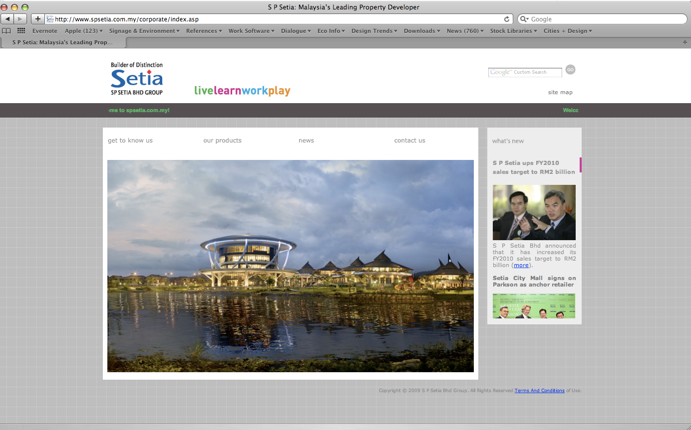
brand identity programme included drafting a new brand architecture that rationalised their wide-ranging operations as well as new overseas ventures. We were also involved in evaluating and simplifying their website, which had a complex structure to accommodate the many sections and audiences of SP Setia.
Additionally, we produced a new visual identity guideline for SP Setia, tailored to be as user-friendly as possible, with clean designs and simple write-ups. This is based on the assumption that the regular user may not be familiar with the task and the process of managing identities or the terms used.
brand identity guidelines
Video (for CHINA, Vietnam & australia)
Our last engagement with SP Setia was Tan Sri Liew’s ‘farewell book’, Touched by Setia.
LINKS


