Project / hp Mobile E-Services Bazaar
Task / Support hp Bazaar global communication, localising content for Asia
managing brand identity and communication; info-graphics for global use
Client / hp Singapore, hp Palo Alto (Silicon Valley), USA
Year / 1998–2003
In May 2000, we received a call from hp Singapore to attend a ‘Brandjam’. This turned out to be a gathering of all creative firms in the region, appointed to work on the hp brand re-positioning. The two-day workshop was an icebreaker, intended for creatives to get to know each other in person (despite some being competitors in their respective fields). We were required to work in teams to solve some intriguing problems, and the winners received some token (someone jokingly quipped ‘measly’) prizes.
“It wasn’t the prize that mattered—it was the excitement and energy generated by each group’s creative ideas, both practical as well as mind-boggling and silly.
A brand workshop such as this is a common strategy to motivate and encourage collaboration across disciplines so that everybody works towards one goal—to build a truly integrated brand across all platforms, from communication to physical environments, to product design and service.
Till today, I still wonder why this isn’t as widely implemented in Malaysia, seeing as how there are obvious disconnects in the integration of many major local brands.”
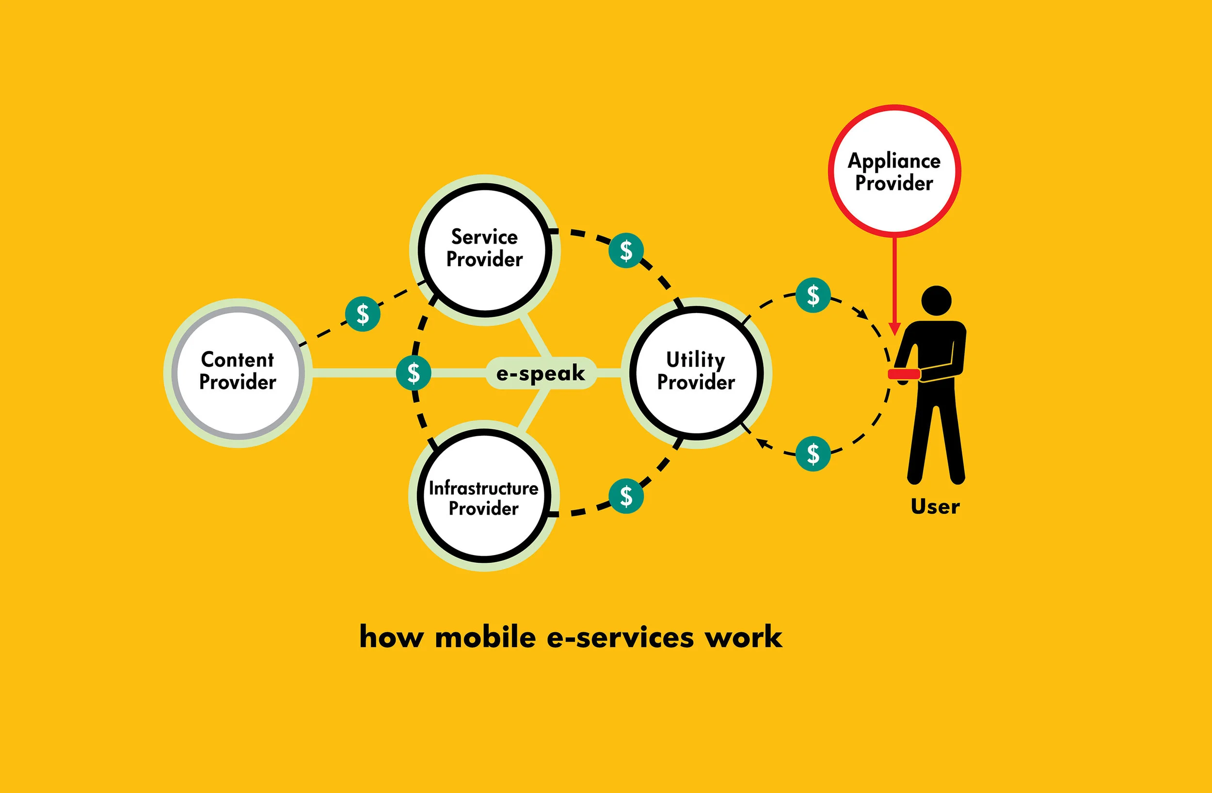
The hp Creative Partners Ecosystem in 2000. Today, several more specialised services would have been added, e.g. UI, UX, etc.
HP BAZAAR
Our company’s specific area of work was to manage communication for hp Mobile E-services Bazaar (Bazaar), a new initiative that anticipated the advent of the mobile revolution.
The Bazaar consisted of a community of customers, application developers, technology partners, content providers, and venture capitalists—all brought together to invent, partner, and promote mobile e-services.
It was made to be open and global, and was structured as a global network of both physical incubation centres and an Online CyberBazaar. The Singapore Bazaar acted as the regional hub for Asia Pacific. The other hubs were Silicon Valley, Helsinki (where the Nokia HQ was located) and Tokyo (Japan was largely a market by itself).
“These were exciting pioneering times, on the cusp of a revolution in the way we live.
At the hp Bazaar in Helsinki, I saw a prototype of a refrigerator with an internet connection to download recipes (from hp’s own internal servers, of course); and a self-driving lawn mower that ran around detecting grass that needed trimming, based on an acceptable length that was programmed in. Just experiments and a lot of fun.”
COMMUNICATING across cultures
Managing the hp Bazaar brand and communication started off quite simply. All initial copywriting came from the US and Singapore offices. Our task was to design and produce the literature for key markets in Asia Pacific, and for a brief period, Japan, New York, and Helsinki. As the Bazaar’s regional activities increased, our copywriter came onboard for the project as well.
Later, on behalf of hp Singapore, I flew to London to look for an agency partner to cover the European market. We chose London-based Contra, whose head office in Helsinki had established Nokia’s brand as the leader in mobile phones. We then focused on Asia.
The work required much attention to details. We had to adapt the text and change the images for each key market so as to be more country and culture-specific. For instance, US is accustomed to the term 'handset', while Asia prefers 'mobile phone', etc.
country-relevant IMAGES
Around the year 2000, the stock photo industry was still in its infancy, and images of Asians were hard to come by. This made it difficult to find suitable images for the Asia Pacific market. We also had to ensure that every image we select matched the aspirations of the hp Bazaar brand: real, natural, familiar, not stylised, no special effects—if you wouldn't see it in life, it’s not appropriate.
The only solution was to send photographers to each key region to take country-relevant images. Once they were done, we went through the images with a discerning eye and the brand in mind—sorting, shortlisting, and retouching as necessary. The photo sets were then labelled and saved in CDs to be couriered to the relevant region (the landline internet connection at that time was not advanced enough to send large files such as these; it was too slow to transfer even a single 10MB file).
INFORMATION DESIGN
PowerPoint presentations are one of the most important channel of communication for company executives. Unfortunately, they are often hurriedly put together by executives who use generic Microsoft clip art and haphazard charts and diagrams. This causes a reputable company to come across as being amateurish and disorganised, and at the same time, subverts and dilutes the grand brand plan of the company.
We conducted a visual audit of the infographics used by hp in their PowerPoint presentations (which were also reproduced in print) and initiated the ‘Global Infographics Project’ (a descriptor we coined and used internally). Upon presenting our findings to hp, we received the go-ahead to proceed.
We redesigned many complex technical diagrams (usually created by engineers or programmers), striving for clarity at all times. Occasionally, this required us and hp to come up with brand names or descriptors that are easier to remember, such as ‘hp myview’, ‘hp smartview’, ‘hp oneview’, etc. These simple names also helped the company market its products.
COMMUNICATING TO END-USER
hp oneview = hp smartview + hp myview
From technical jargons to marketable product names
Product folder
Product folder, open with two pockets.
Photographic images are styled according to hp’s global identity, portraying an ordinary slice of everyday life.
INFOGRAPHICS GUIDELINES
Throughout the design process, we recognised that it was not easy to please everyone. The infographics that we designed for Asia were not well received in Europe. Helsinki disliked the bright vibrant colours that were preferred in Asia, so we designed options with a neutral / autumn colour palette. We then spent the next year designing infographics with options, not only of colours, but also of language and information (e.g. the components of a Bazaar ecosystem were not necessarily the same for every country).
The infographics had to be continually updated to reflect new advancements in technology, process, and markets. Colour options were important for another reason—a diagram could be placed on a layout with a similar or incompatible colour.
EVENTS—idea generator
Our company acted primarily as an idea generator for hp events, guided by the core values of hp Bazaar’s brand and its global connections. Ideas were quickly sketched out and emailed to hp Bazaar Singapore. Some of our ideas were implemented, while others were kept for future reference.
One problem that every corporation faces is the search for unique gifts for conferences, trade shows, and other events. In the case of hp Bazaar events, which took place in both the east and the west, we suggested for hp to source gift items from one region to send to the other.
As example, I proposed to use the wooden 'mobile phone' (which is actually a bottle opener)—something that I picked up at an airport souvenir shop in Helsinki—and scented candles sourced from Bangkok as gifts for programmers attending a hp summer camp.
A CASE STUDY
hp Bazaar Summer Camp in Beijing, 2002
The hp Bazaar Camps were a revolutionary concept at the time. Over three days and two nights, developers from numerous countries working together or alone—helped by HP specialists, power drinks and more than enough food—created prototypes and new mobile services concepts. The Camp in Beijing was not the first Bazaar Camp (the first was in Helsinki), but it was certainly one of the most memorable in Asia.
Two hp Bazaar Summer Camps were held in 2002, one in Helsinki (in April, their second Camp) and the other in Beijing (September). While the programme for both Camps were somewhat similar, the design and communication for each was localised—except for certain items to rationalise production costs, such as the goody bag ('goodie bag' in Asia), which differs only in colour and message.
In Beijing, developers from more than 10 countries underwent 48 hours of extreme programming, often overnight.
The contents of the goody bag contained practical items (such as toothpaste, medicated ointment from Singapore to sooth their tired muscles, etc) as well as assorted memorabilia, including a specially carved Chinese seal to commemorate the occasion. Liaising closely with hp Singapore and Beijing, the entire design development was coordinated by our office in Kuala Lumpur.
As more than half the participants came from countries outside of China, with the general perception that China—which was only beginning to open its doors to foreign entry—was still under ‘communistic control’*, we designed the goody bag to play on this idea, tongue-in-cheek.
*Today, the official term to describe China’s unique social, political and economic system is “socialism with Chinese characteristics.”
Medicated ointment for muscle pain, from Singapore.
Concepts were conveyed to various approving parties with quick sketches. From the visuals presented, there was a clear preference for the binary code (01010101) option, which we then transformed into the image of a wushu martial artist. It became the icon for the Beijing Summer Camp.
T-shirts for participants.
FRONT: ‘bazaar rocks, beijing shakes’
BACK: ‘I am Bazaar. how about you?’
T-shirts for participants.
FRONT: ‘bazaar—it’s where stars are born’
T-shirts for hp crew.
FRONT: ‘Proud to be Bazaar’.
You can see the participants and crew wearing these t-shirts in the video.
In 2000, almost all signs in the city were in Chinese. Directional signs with powerful, instantly recognisable visuals were essential to help first-time visitors find their way around. We created signs that not only had a strong sense of branding, but were inspirational as well. They also served to promote hp and the Summer Camp to the public.
Hidden dragon and sleeping tiger (Where talent is being concealed?)
A true man should have ambitions that span the four directions
Become famous instantly... (anticipating the instant gratification generation)
A heavenly steed soaring across the sky (Go for a powerful and unconstrained style)
The eight immortals crossed the east sea, each one displaying his or her own special ability (Shine along with your colleagues)
Three heads and six arms (You have inexhaustible ideas and resources)
The size and location of directional signs were tested in Beijing, and the images were emailed to us for comments.
A special ‘power drink’ awaits all at the Summer Camp.
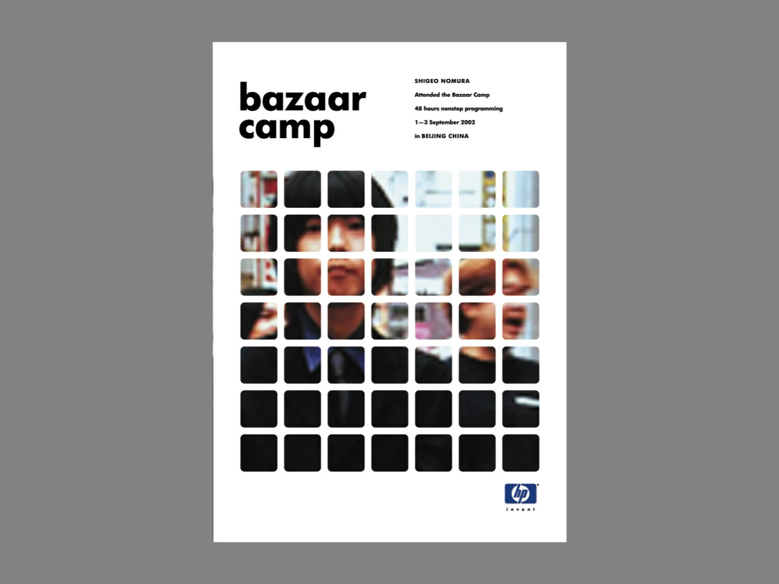
Our idea for the certificate of participation for the Camp involved designing an artwork template that was based on the hp identity—its core element is a grid of squares or rectangles with rounded corners.
To personalise the certificate, participants was requested to submit a photograph of their choice. There were no conditions set as to the type of images submitted, as long as it came from the participant.
The certificates were then laser printed on the spot.
On to the next... a third Summer Camp in Helsinki?
HP—HEWLETT PACKARD
Besides hp Bazaar, we worked on other design collaterals under the hp endless possibilities brand, often bringing Asian concepts and sensibilities to the work.
In this 1999 table-top calendar, we reflect on the idea of ‘Simplicity’—ultimately, what appears to be so simple is in reality, multi-faceted.


